5 Top-Rated Tips to Create High-Converting Mobile Landing Pages
Categorized as : Ecommerce and Shopify Apps
In the last few years, smartphones have conquered the market. Being cheaper and more portable than computers, they offer a perfect balance of style and functionality. Mobile internet doesn’t tie you to the place, making it possible to shop wherever you want and whenever you want. That’s why more and more people prefer mobile phones for online shopping.
To confirm, let’s turn to the statistics. According to our research, people spend 73% of their media time on their smartphones. Also, 11% of people all over the world are mobile-only. It means they use only smartphones for surfing the internet. The US figures are even bigger, reaching 17% of the mobile-only population. About 55% of all online orders are done via mobile phones and tablets.
As you see, the figures are impressive. And now get ready for even more surprising figures!
About 70% of small businesses are not mobile responsive. Only 76% of the world's most popular websites are mobile-friendly, while the rest have poor navigation for mobile users. And finally 32% of mobile users leave a website with unresponsive design forever even if they like its products and services. Now you can calculate the possible income loss caused by website unresponsiveness.
So today we’re going to find out how to make your online store mobile responsive and describe tips to follow while doing it.
How to make your online store mobile-friendly?
There are two main ways of creating web pages attractive to mobile users. You can design specialized pages solely for mobile or make all your web pages mobile responsive. The first option can be too time-consuming and cause some SEO issues, that’s why we recommend giving preference to mobile responsive design.
The responsiveness is usually achieved through special themes, templates, and widgets. Shopify users can find responsive themes and templates in some page-building applications or buy them in the Shopify theme store.
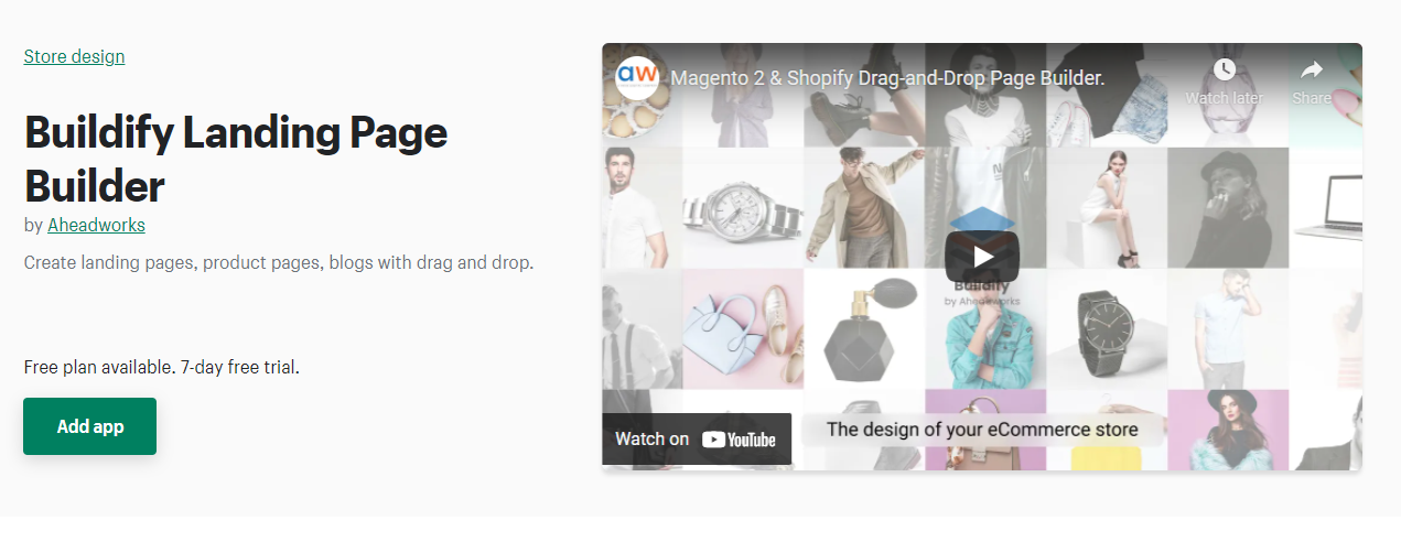
Today we are elated to introduce one of the best page-building applications for your Shopify store, possessing all necessary features to create responsive web pages. Buildify Landing Page Builder offers its users store mobile onsite templates and widgets.
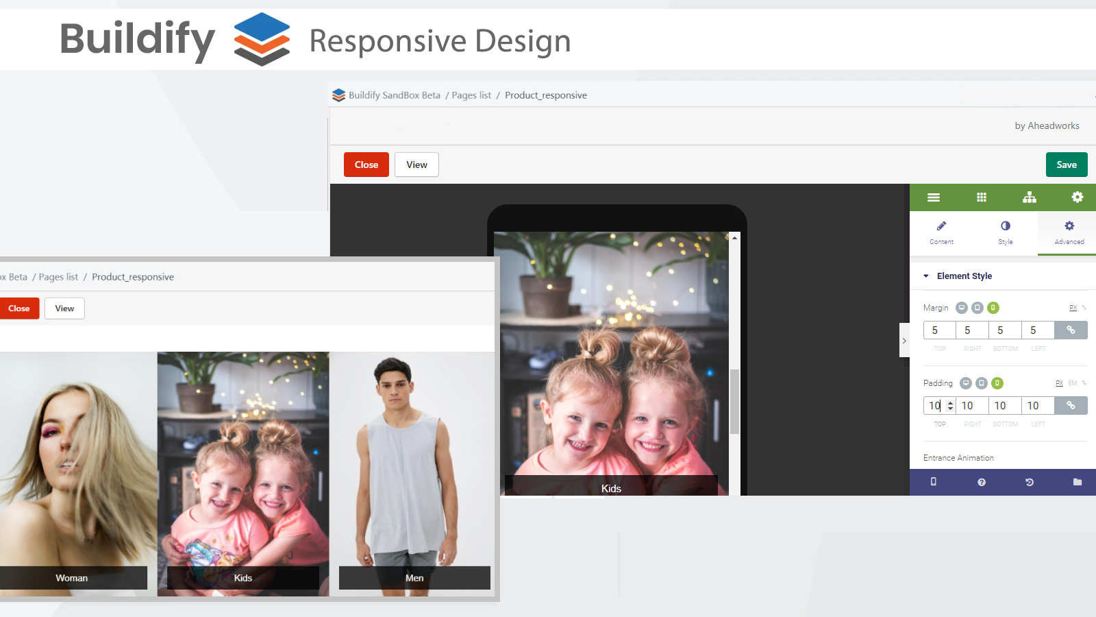
The 3 image dimension options allow merchants to set a specific image dedicated for desktop, tablet, or mobile users, which contribute a lot to an amazing look-and-feel of the page on any device. Besides, the in-build mode allows Buildify users to check how the page renders on different screen sizes (mobile, tablet, desktop) right from the editor.
Thanks to premade templates and drag-and-drop design you can create landing, product, contact, and other web pages in a few clicks and stay confident in their responsiveness. Moreover, you don’t need to mess with the code to build and customize pages of any type. Find more Buildify opportunities on the landing page.
And now when you know the tool you need for creating web pages, let’s learn about the peculiarities of the process itself.
The challenge of creating responsive landing pages
A responsive landing page is a page on a website designed for any device user. It means that the content looks applicably good on any device including mobile phones. The content on such pages should be approximately the same for device versions, so customers don’t miss any vital information no matter what device they’re using.
However, when creating a responsive landing page much attention should be paid to page elements such as buttons, fonts, or columns. As smartphones have a smaller display, these elements can shift while optimizing. That’s why it’s allowed to have small differences between device versions.
For example, the mobile version has a single-column layout, that’s why more blank space should be added between sections while optimizing your landing page. Also, button size matters in mobile versions, they should be quite big and clickable. Headings, on the contrary, usually get shorter on mobile versions to sustain an optimal look. At last, nobody wants the headings to occupy the whole screen on their mobile device.
Taking the mentioned above facts into account, we prepared 5 tips for you to follow while creating mobile landing pages.
Mobile landing pages best practices
1. Prefer a single-column layout.
It’s a widespread mistake of desktop-only websites to employ a multi-column layout. The mobile users are sick of shifted content, which at its best become lost somewhere on the page or disappear at all. The best thing you can do for your mobile clients is stick to a single-column layout to prevent clutter and destruction.
Nevertheless, it doesn’t mean you have to keep the single-column structure for the desktop version. The useful Buildify features, margins, and paddings will help you customize the look of your content for any device.
2. Use a large readable font.
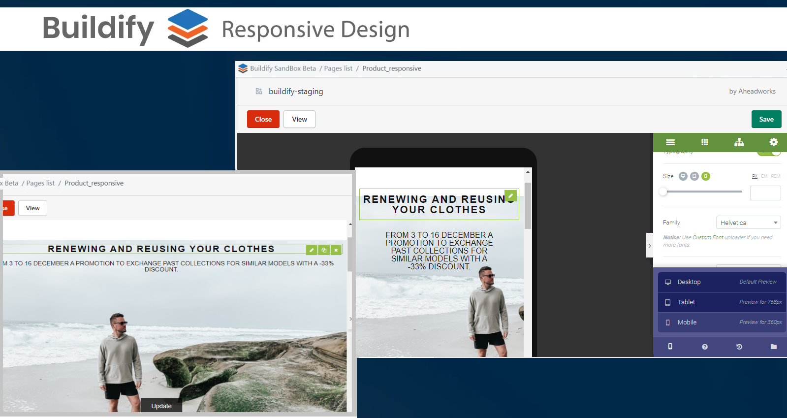
The font set for desktop may appear to be too big or too small in the mobile version. Together with font size, its readability should be checked before publishing a page. While the desktop version is the field for making design experiments, the mobile version needs a more subtle approach. It provides a much smaller area to play with.
Choose mobile-friendly fonts and use line breaks, headings, and bullet points to keep it readable. You can also try bolding or capitalizing different lines of text to stop them from merging into one another. With the help of preview mode check if your content is large enough and clear enough to read on a smaller screen.
3. Customize button size and location.
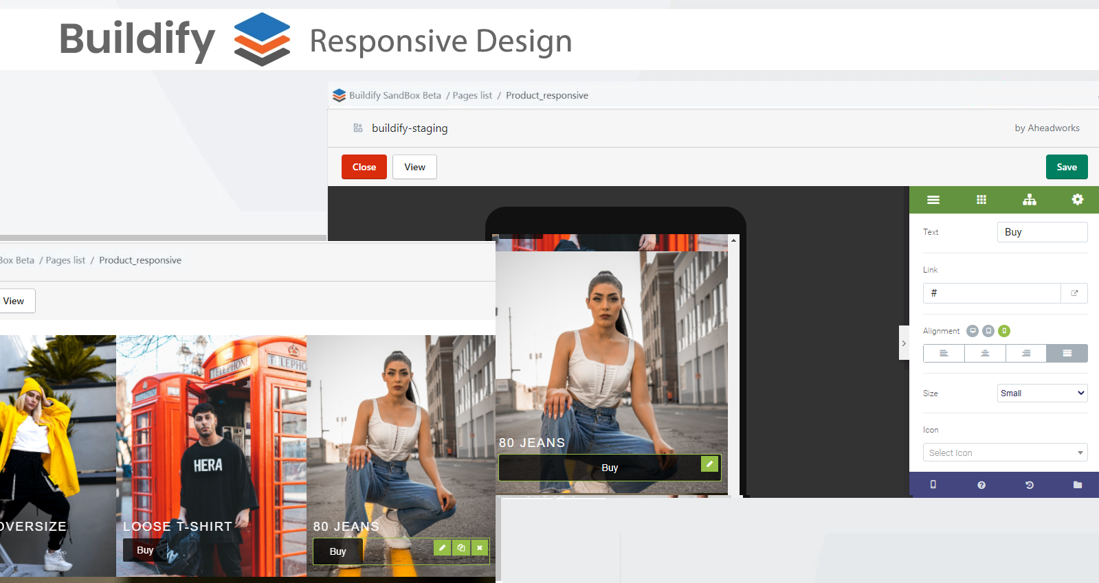
The main aim of any landing page is to attract attention to products or services and convert. Thus a CTA button is a core element of the landing page. However, a good CTA button for the desktop version can turn out to be the wrong size and in the wrong place for mobile.
Make sure your button is clickable: it should be big and easy to reach. The best way to achieve the right size is to set it in percent rather than pixels. In this way, it will be changed automatically depending on screen dimension. The most popular locations of CTA buttons are bottom-centered and bottom-right, so the customer could easily reach it with his thumb.
4. Control load time.
In 2022 slow loading should be recognized as a crime. Really! Nobody likes to wait, especially mobile users. Their connection is not as reliable and stable as the desktop one. The slow page load can strike website reputation greatly. The research shows that buyers are 62% less likely to buy your product or service after a negative mobile experience. That’s why it’s so important to optimize your website.
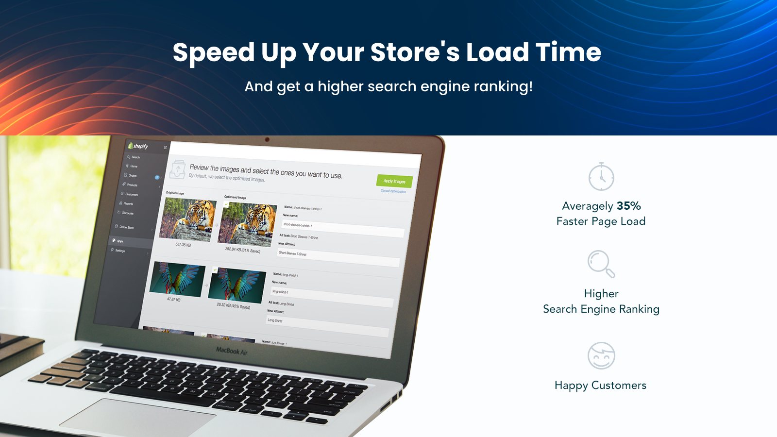
Start with image optimization. Minifier SEO Image Optimizer is designed to speed up the page load by compressing images by up to 70%, without reducing their quality. Additionally, it boosts Organic Traffic and improves your Search Engine Results by automatic file names and alt tags optimization. All you need is to set your optimization preferences once and leave Minifier to do the rest of the work.
5. Keep concise.
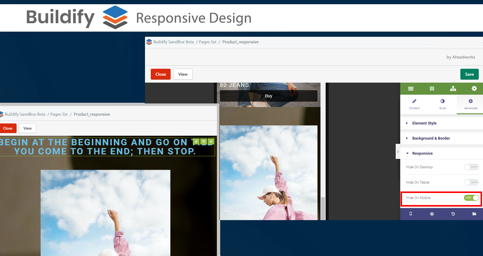
Your landing page content should be concise not to overload customers with information. For the mobile version, it becomes all the more important. You can easily hide too massive elements for any device version in Buildify advanced settings. Just tap the toggle and check the result with preview mode.
Final Thoughts
Nowadays it’s incredibly important for eCommerce businesses to be mobile responsive, as more and more customers prefer shopping via smartphones. The responsive design attracts visitors and maintains the brand's reputation.
Use Buildify to create amazing mobile landing pages quickly and effortlessly!


